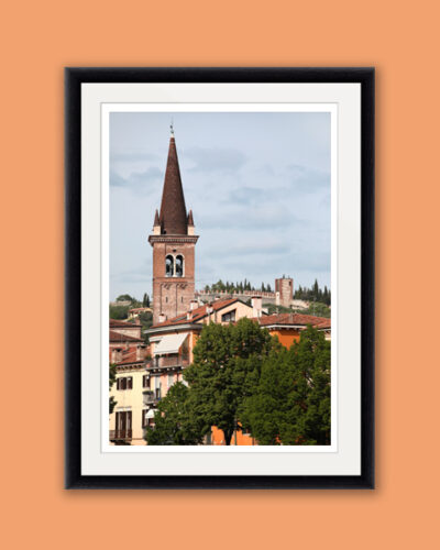
Flavors
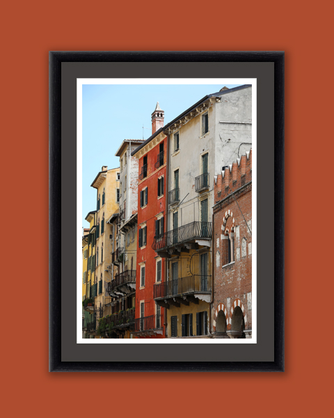

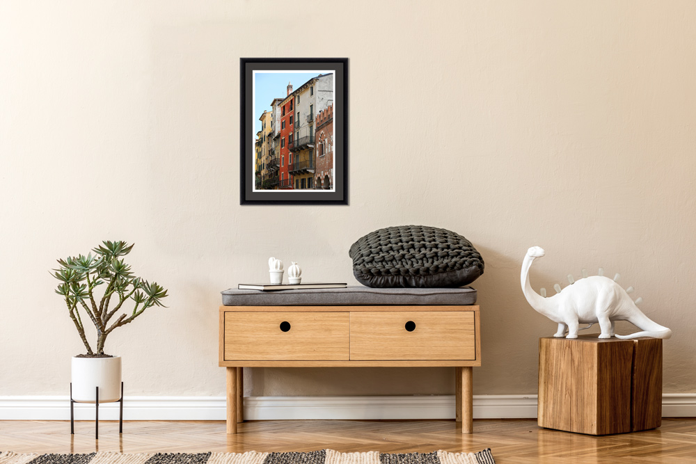
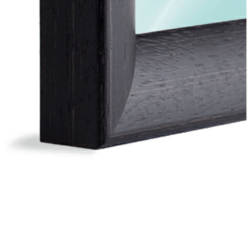

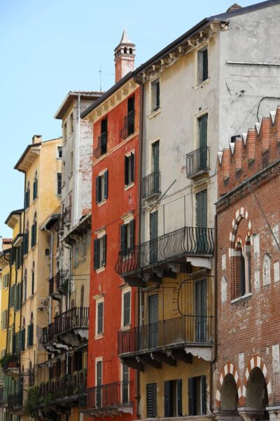


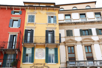
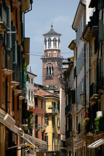
The spirit of Verona, Italy is portrayed on its streets full of different warm colors and textures. Photographer and Digital Artist, Scott Allen Wilson, shows a street with an architectural style that is traditional to this city. The warm colors of the image can dress up any wall and give it a homely touch. The print has been realized on Hahnemühle FineArt Pearl paper and mounted with an anthracite passe-partout. It is displayed underneath a matte float glass and surrounded by a beautiful ebony solid wood frame. Every element of this piece was individually selected with the intention of being a part of a unified piece of art.
I think this print perfectly encapsulates the essence and the energy of Verona, Italy. I hope you love it 🙂
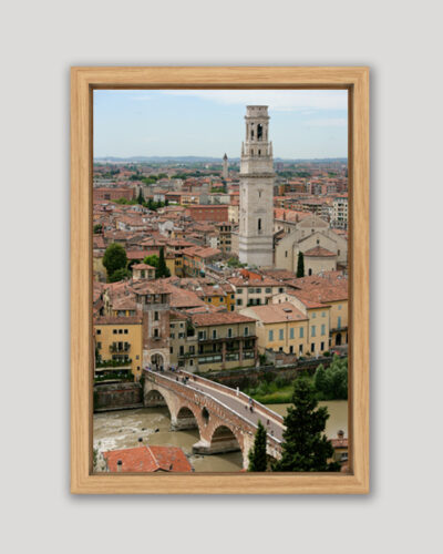
Like what you see? Be sure to scroll down to see a 3D video of Flavors ?
15% of every purchase on my website is donated to charity
Fine Art Details
Every detail of this piece was intentionally selected for quality, craftsmanship, and longevity.
Not finding what you are looking for?
Send me a custom request below :)
A Full-Cycle Curation Process
Every artwork I release carries a story with it, from moments of wonder and human connection to the long hours spent waiting for the image I envision. I finish each piece by hand with care, and 15% of every purchase is donated to charity because this work is about giving back as much as it is about creating.
Once you’ve chosen a piece that resonates with you, I personally prepare it for printing and curate every detail of the final presentation. From the paper and print size to the frame, glass, and passepartout, each decision is made to honour the image and ensure it will live beautifully in your space for decades. When everything feels just right, I apply my digital signature and your artwork is custom made to order.
When you collect one of my works, you are supporting a photographer who genuinely cares about the world. My purpose is to make the places I visit more accessible, to spark curiosity, and to invite deeper cultural connection. I hope your chosen artwork becomes a catalyst for meaningful conversations and a quiet reminder of how interconnected we all are.
To learn more about the materials and process, read here: Gallery-Quality Frames, Print and Finishes.

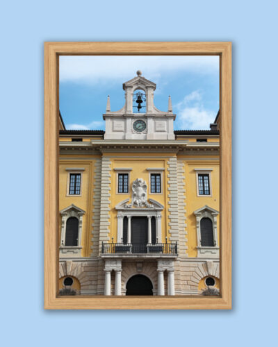
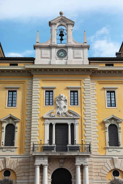
Click to watch the 3D video below:
Thoughts and Ponderings about Flavors
Many of Verona’s buildings are painted different colors for several reasons.
Firstly, the use of different colors was often a way for the builders and owners of these buildings to distinguish their properties from each other and express their individuality and wealth. By using different colors and materials, they could create a unique and recognizable facade that set their building apart from others.
Secondly, the use of different colors was also influenced by the cultural and architectural traditions of the time. During the medieval and Renaissance periods, the use of bright and bold colors was common in Italy, and Verona was no exception. These colors were used to create a visual impact and to express the prosperity and power of the city.
Finally, the use of different colors was also a practical consideration. In the past, buildings were often made from different materials that had their own inherent colors, and painting the buildings a different color helped to protect them from the elements and extend their lifespan.
In conclusion, the mix of colors in Verona’s old city center is a result of a combination of historical, cultural, and practical factors, and it adds to the city’s unique and charming appearance.
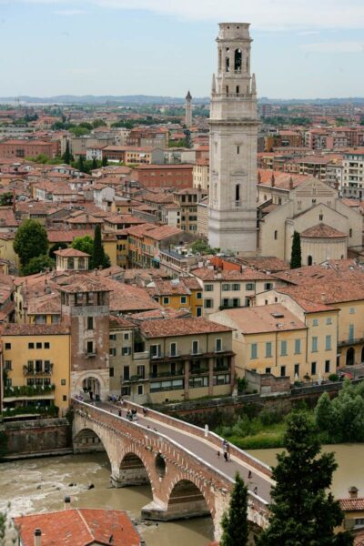
Check out this blog about Verona:
Only logged in customers who have purchased this product may leave a review.
Related products
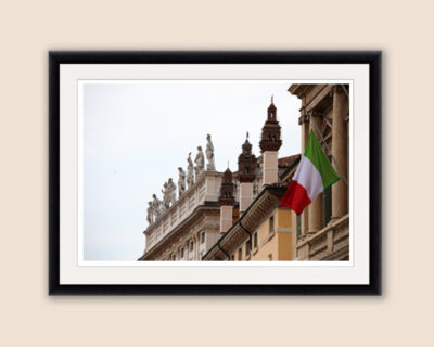
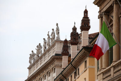
Verona
From: €249.00
Estimated shipping date 2026/03/15
Verona
From: €249.00
Estimated shipping date 2026/03/15
Verona
From: €249.00
Estimated shipping date 2026/03/15
Verona
From: €249.00
Estimated shipping date 2026/03/15
Verona
From: €269.00
Estimated shipping date 2026/03/15
Verona
From: €249.00
Estimated shipping date 2026/03/15
Verona
From: €269.00
Estimated shipping date 2026/03/15
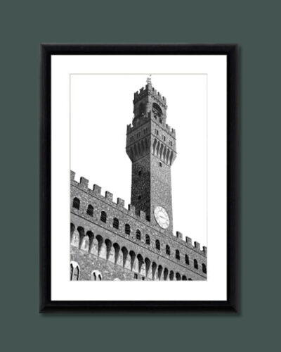
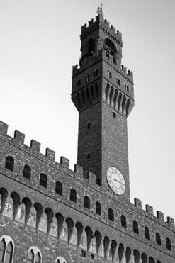
Florence
From: €299.00
Estimated shipping date 2026/03/15

Reviews
There are no reviews yet.