Flavors
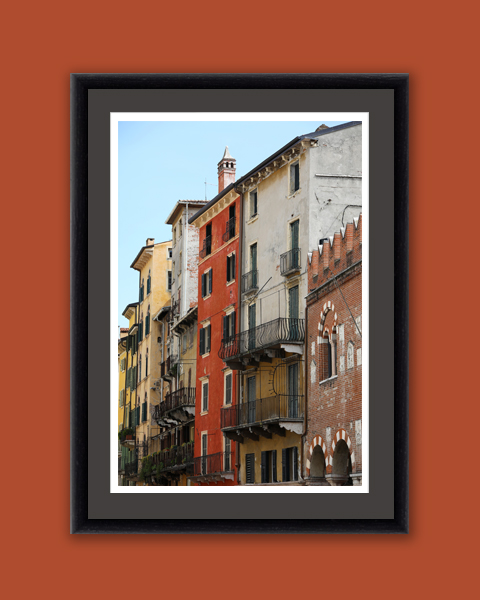


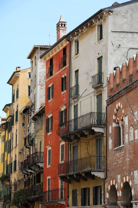
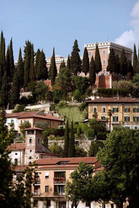
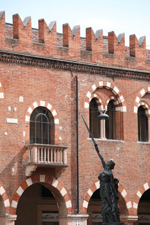
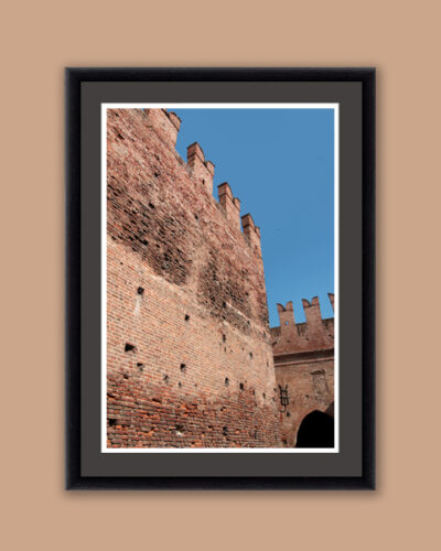
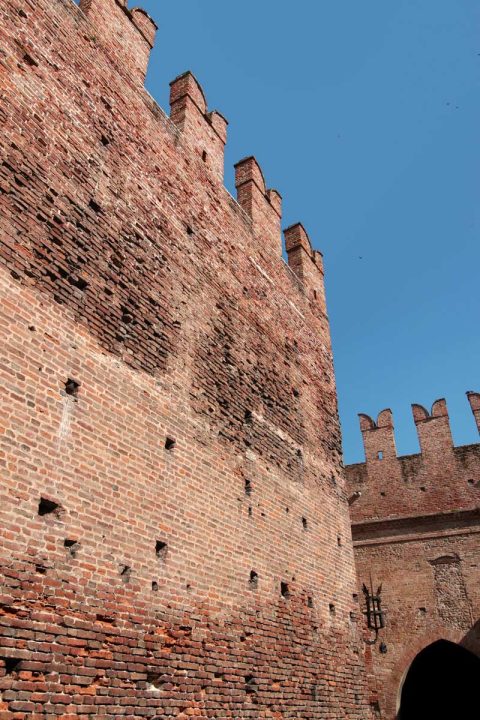
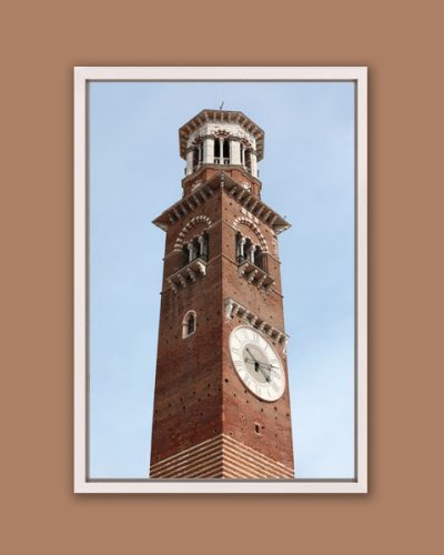
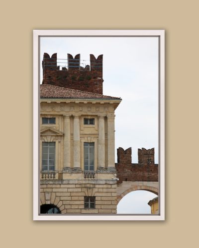
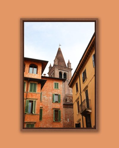
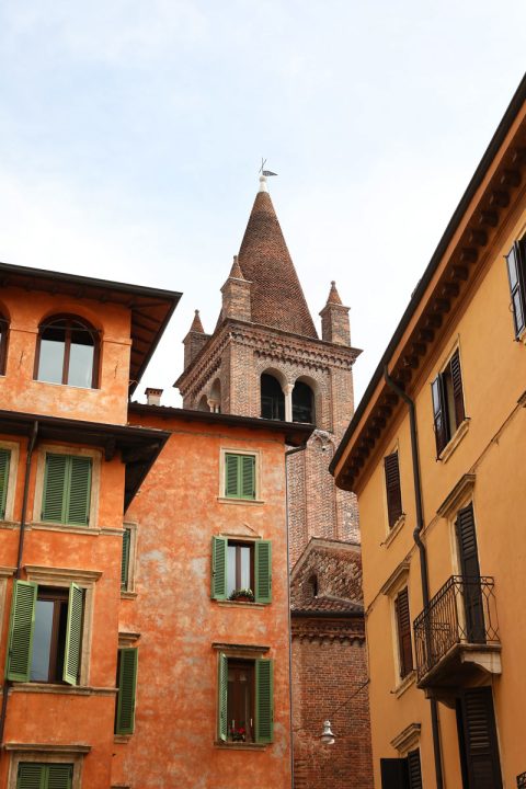
The warm colors on the building facades of Verona seem to welcome visitors. Their tones shift between sun-washed ochre to deep terracotta, holding the heat of the day and releasing it slowly into the evening streets. There’s a quiet generosity in them, an openness that mirrors the rhythm of the city itself.
Each piece of art is custom-made to order. I personally apply a digital signature, carefully adjusted in size and color to complement the artwork. To me, every detail, from framing to finish, is a continuation of the artwork. I hope you enjoy it. Please allow 10-14 days for production and delivery.
15% of every purchase on my website is donated to charity
Fine Art Details
Every detail of this piece was intentionally selected for quality, craftsmanship, and longevity.
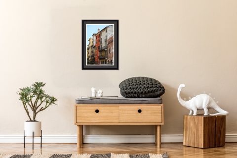
Made for people who feel connected to the places they have lived, loved, or returned to. Professionally framed fine art, thoughtfully shaped by years of travel, observation, and careful curation. Made to order and ready to hang.
A Full-Cycle Curation Process
Every artwork I release carries a story with it, from moments of wonder and human connection to the long hours spent waiting for the image I envision. I finish each piece by hand with care, and 15% of every purchase is donated to charity because this work is about giving back as much as it is about creating.
Once you’ve chosen a piece that resonates with you, I personally prepare it for printing and curate every detail of the final presentation. From the paper and print size to the frame, glass, and passepartout, each decision is made to honour the image and ensure it will live beautifully in your space for decades. When everything feels just right, I apply my digital signature and your artwork is custom made to order.
When you collect one of my works, you are supporting a photographer who genuinely cares about the world. My purpose is to make the places I visit more accessible, to spark curiosity, and to invite deeper cultural connection. I hope your chosen artwork becomes a catalyst for meaningful conversations and a quiet reminder of how interconnected we all are.
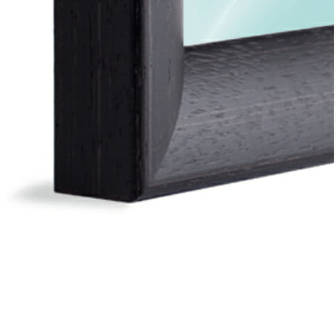
To learn more about the materials and process, read here: Gallery-Quality Frames, Print and Finishes.

Related products
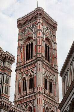
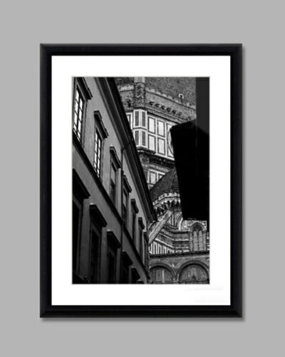
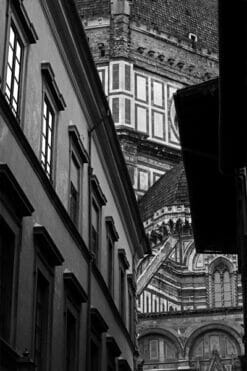
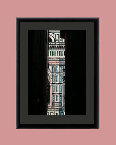
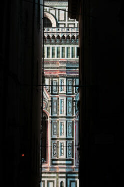
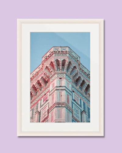
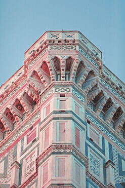
Florence
From: $449.00
Estimated shipping date 2026/05/01
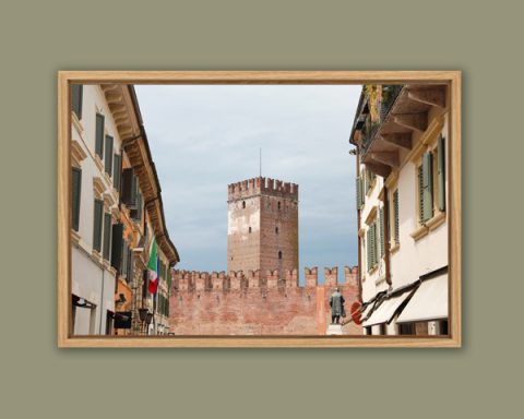
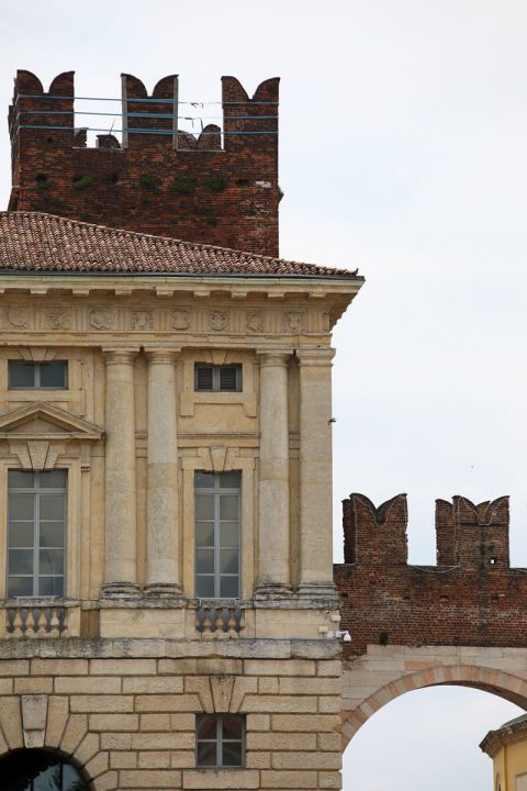
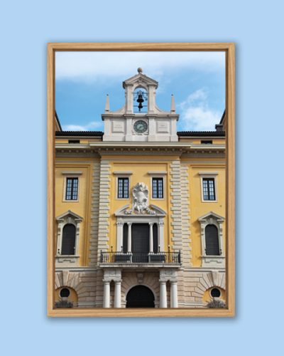
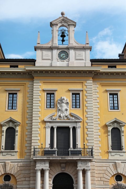
Verona
From: $449.00
Estimated shipping date 2026/05/01
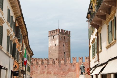
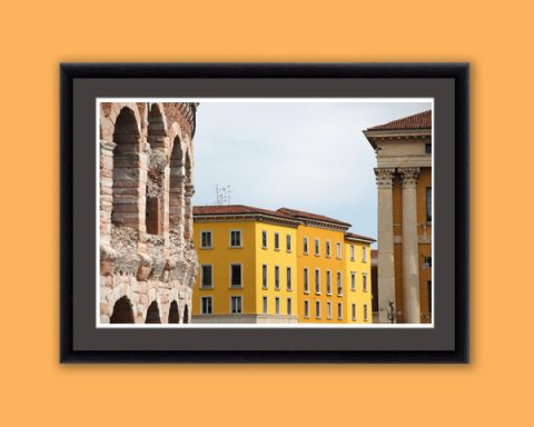
Verona
From: $499.00
Estimated shipping date 2026/05/01
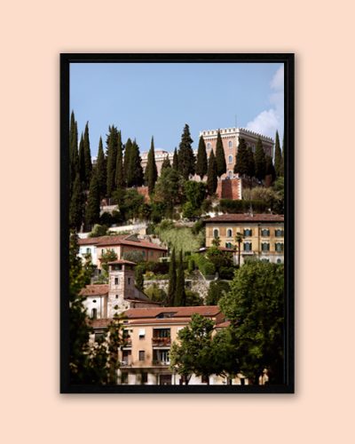
Verona
From: $499.00
Estimated shipping date 2026/05/01
Verona
From: $449.00
Estimated shipping date 2026/05/01
Verona
From: $499.00
Estimated shipping date 2026/05/01
Verona
From: $499.00
Estimated shipping date 2026/05/01
Florence
From: $459.00
Estimated shipping date 2026/05/01
Not finding what you are looking for?
Send me a custom request -->
Reviews
There are no reviews yet.
Only logged in customers who have purchased this product may leave a review.
Click to watch the 3D video below:
Thoughts and Ponderings about Flavors
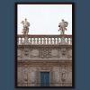
Many of Verona’s buildings are painted different colors for several reasons.
Firstly, the use of different colors was often a way for the builders and owners of these buildings to distinguish their properties from each other and express their individuality and wealth. By using different colors and materials, they could create a unique and recognizable facade that set their building apart from others.
Secondly, the use of different colors was also influenced by the cultural and architectural traditions of the time. During the medieval and Renaissance periods, the use of bright and bold colors was common in Italy, and Verona was no exception. These colors were used to create a visual impact and to express the prosperity and power of the city.
Finally, the use of different colors was also a practical consideration. In the past, buildings were often made from different materials that had their own inherent colors, and painting the buildings a different color helped to protect them from the elements and extend their lifespan.
In conclusion, the mix of colors in Verona’s old city center is a result of a combination of historical, cultural, and practical factors, and it adds to the city’s unique and charming appearance.
Reviews
There are no reviews yet.